




In short
Choose numerals that belong to the house: a modest serif in black or aged brass on a Georgian or Victorian door, a clean sans serif on a modern one. Fix them high on the door or on the wall beside it, in a colour that contrasts with the background, and light them. We’d go no smaller than 100 mm.
House numbers are one of the first things a visitor sees and one of the last things most of us choose. The architect Mark Holmquist told Livingetc that, done well, numbering adds a polish people sense without quite noticing it, and that some architects have drawn their own lettering so the numbers belong to the building as much as its windows and door.
Most house numbers that look wrong, or can’t be read, fall into one of six mistakes. Here is each one, with what architects and designers do instead, and our own view marked as ours.
1. Numbers too small to read from the pavement
Designers size lettering for the distance it’s read from. The Design Museum’s account of Jock Kinneir and Margaret Calvert’s road signs explains that the size of their lettering varies with the speed of the traffic, and that every proportion in the system was set from the width of a letter’s stroke, after tests of reading distances. For a house the test is simpler. Mark Holmquist’s starting point is that numbers need to be clearly visible from the street, and Ideal Home suggests oversized numbers where a house is set back from the road.
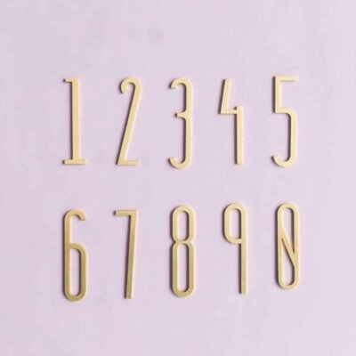
We haven’t found a designer who gives a minimum size, so these figures are ours. We’d treat 100 mm as the smallest number for a door close to the pavement, and go to 150 mm or more behind a front garden, or repeat a smaller number on the gate. A tall, thin typeface reads less well at a distance than a bolder one of the same height, so judge the weight of the line as well as the size. Our METRO and EZRA numbers run from 4 to 12 inches, about 102 to 305 mm. AMYTHUS numbers are 70 mm in a tall, narrow typeface, so we’d keep them for a door or fanlight close to the path.
2. A typeface at odds with the age of the house
Designers choose lettering from the house’s own period. That is Holmquist’s first advice: Arts and Crafts lettering on a Craftsman bungalow, clean sans serif metal numbers on a mid-century modern home, classic serif numerals on a Colonial one. On a British street we’d read that as a serif numeral for most Georgian, Victorian and Edwardian fronts and a sans serif for houses from the interwar years onwards. He adds that a deliberate contrast, modern numbers on a very traditional house, can work when the lighting and planting are part of the same plan.
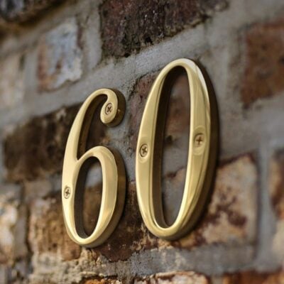
A Georgian door is about restraint. Christopher Boyle, then chairman of the Georgian Group, told Country Life that a front door should be scaled to the building it serves and designed as an ornament to the whole facade, and the Group asks that anything new be as subtle, discreet and well proportioned as possible, so we’d keep to modest serif numerals there. Country Life notes that Victorian doors, where size allowed, carried heavy or ornate door furniture, while the Edwardians followed the later Georgians in choosing simpler, more elegant metalwork. We’d choose a serif with some weight for a Victorian house and something lighter and plainer for an Edwardian one.
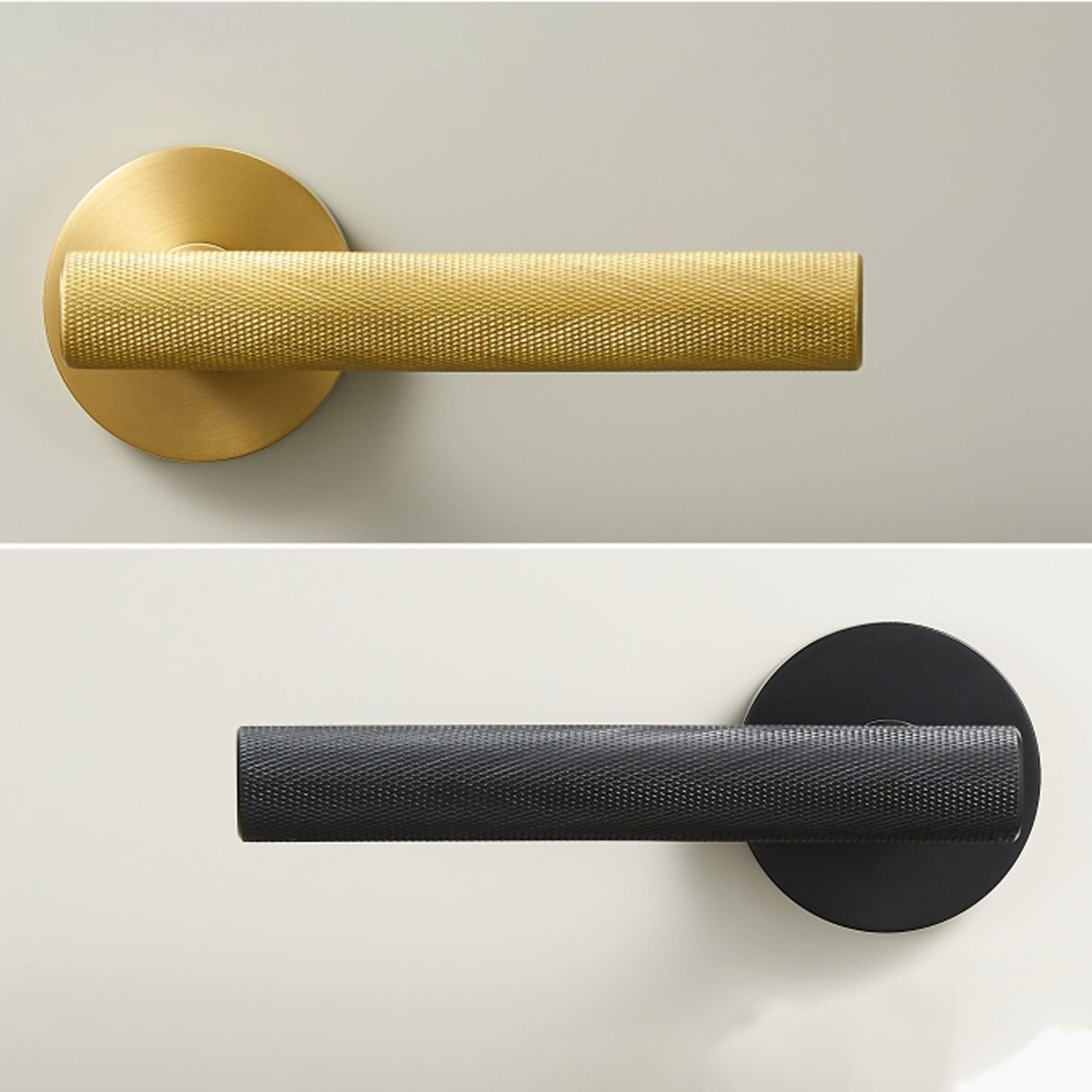
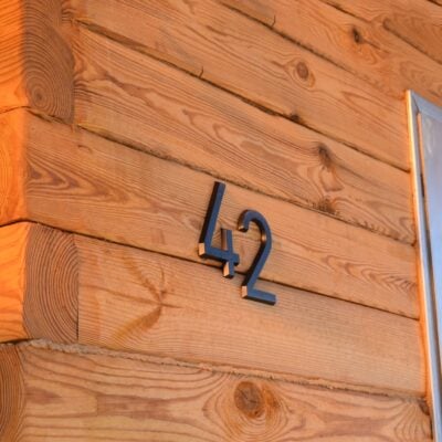
Modern fronts offer more freedom. Homebuilding & Renovating suggests an etched number on the light timber door of a modern home, and floating numbers, held off the wall on concealed fixings, cast a small shadow that suits plain render or brick. In our range, EZRA is a geometric sans serif in solid brass and PECK uses a bold contemporary typeface. OBRE and BROOKFIELD are clean modern numerals, and for a period house ANTIK is a traditional serif in an aged bronze finish, designed with older properties in mind.
3. Chrome or shiny brass on a Georgian door
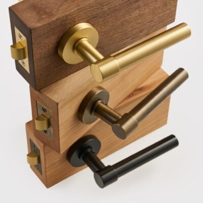
On a period door, designers choose a darker, quieter metal. The designer Tom Rutt told Livingetc that good bronze or aged brass ironmongery suits a traditional door best, and that « chrome would really look out of place on a traditional door »; on modern doors, he notes, black hardware has become the popular choice. The Georgian Group’s guide to doors points out that fittings on external Georgian doors, at least before about 1810, were rarely polished brass: they were usually cast iron painted black, and the Group warns that shiny modern fittings dominate the rest of a door. Writing in Country Life, Matthew Dennison observes that most traditional door furniture is brass, with bronze and cast iron alongside.
So on a Georgian door we’d choose numerals in black or aged brass and keep the brightest brass for the knocker, if you have one. On a Victorian or Edwardian door, aged brass or bronze sits well with an original knocker and letter plate. On a listed building or in a conservation area, talk to the council’s conservation officer before you drill, as the Georgian Group advises before any work to a Georgian house.
4. Numbers that disappear into the wall behind them
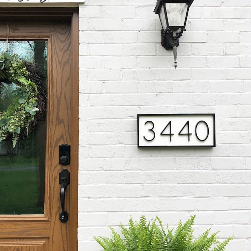
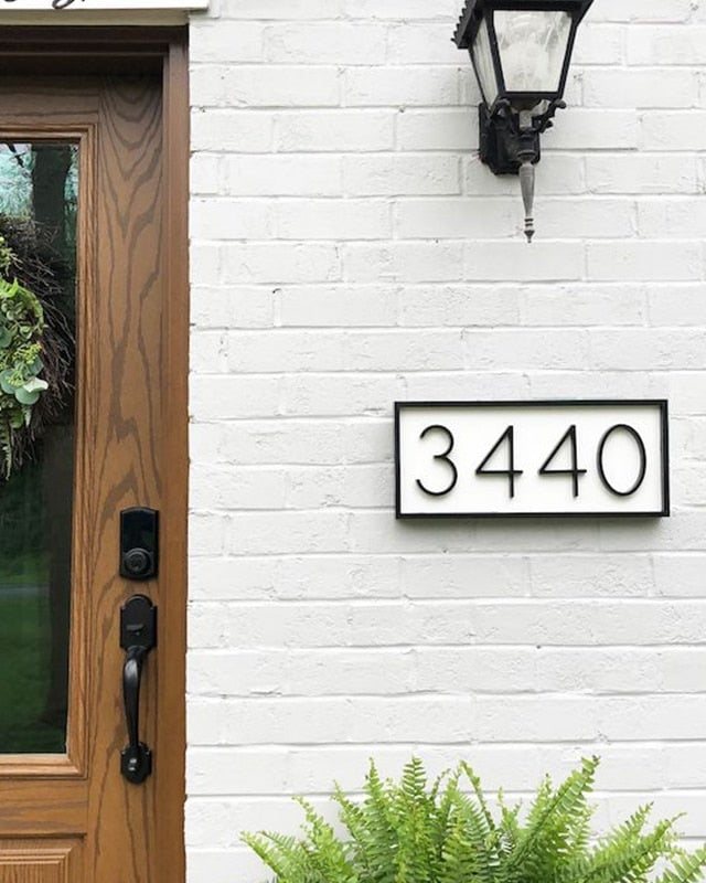
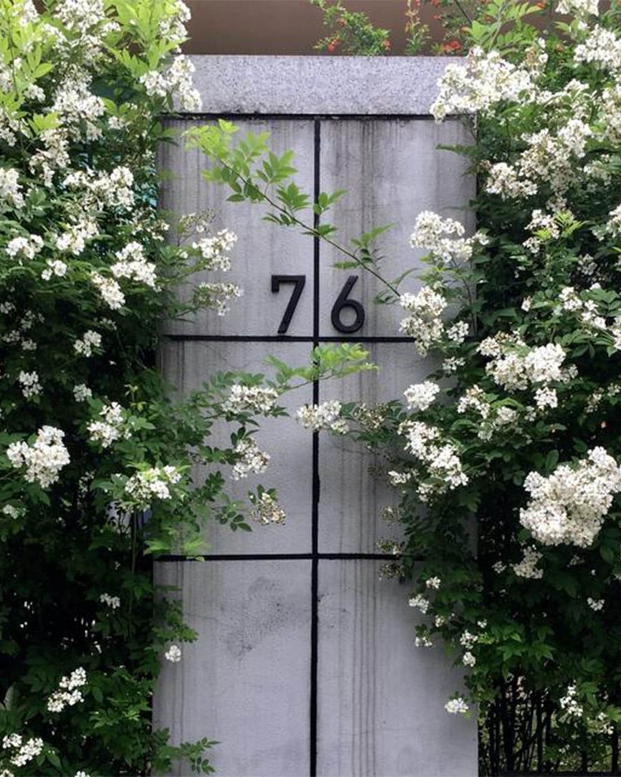
Designers rely on plain contrast: Holmquist’s advice is dark numbers on a light wall, or the other way round. Black numbers suit white render and pale stone; white numbers suit dark render, engineering brick and deep painted doors, which is where our EZRA numbers in white belong.
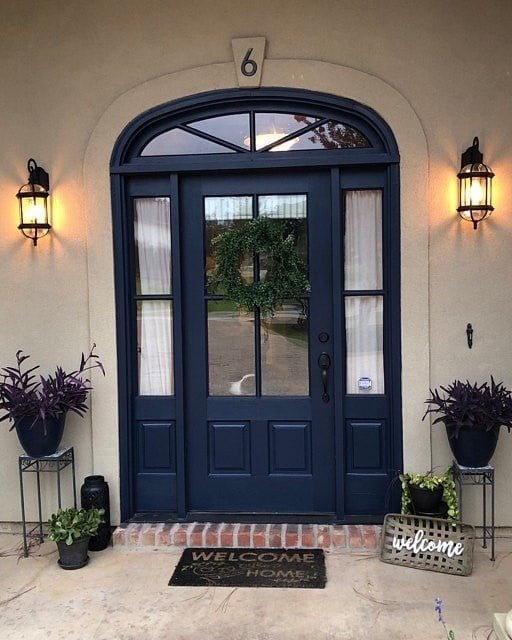
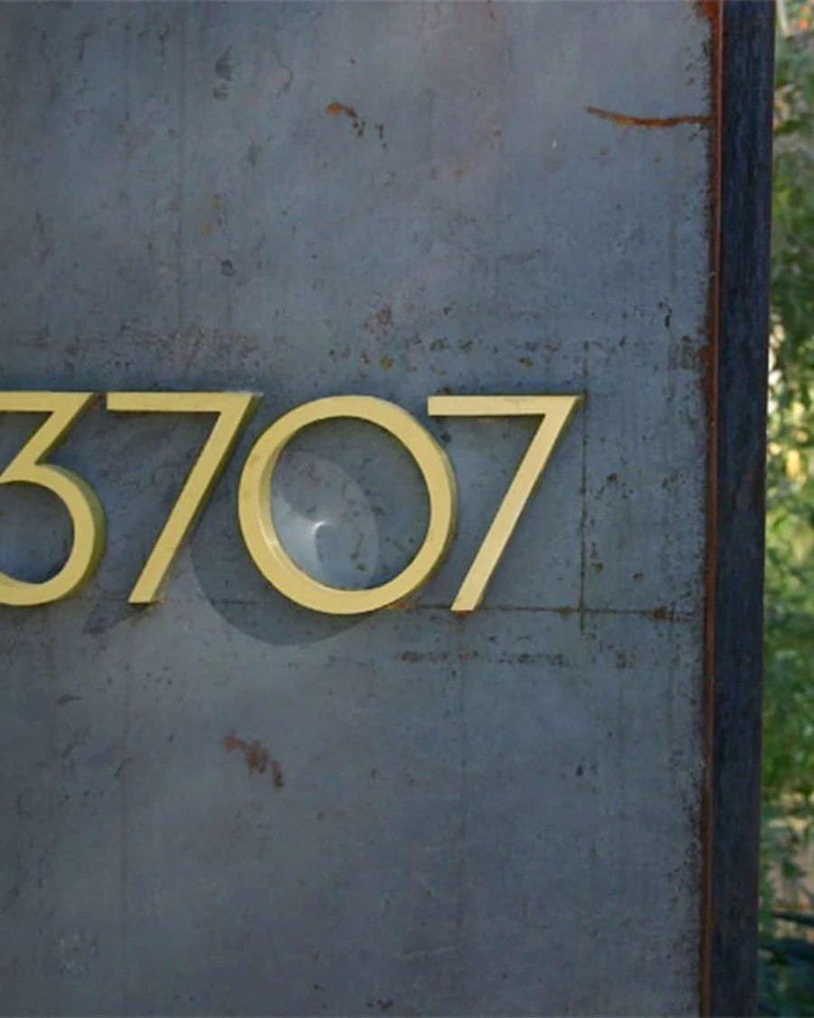
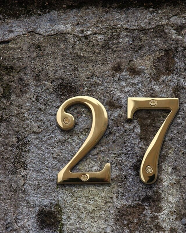
Brass reads best against strong colour. In Architectural Digest’s survey of front door colours, the San Francisco designer Emilie Munroe found a brass bumble bee knocker popped against a glossy blue door, and the Connecticut designer Chauncey Boothby chose a black door partly for its contrast with the brass latch and knocker. House & Garden’s guide to choosing a front door advises matching hardware to the door, warm finishes with warm colours and shinier fittings with gloss paint. The decorator Rita Konig told the magazine that a very dark green or blue is often better than true black, and we think brass looks particularly good on one. On a bright, south facing wall we’d choose satin or matte numbers, since polished finishes flash in low sun.
5. Numbers nobody can read after dark
Designers light the number as well as the door. The designer Abigail Ahern told Livingetc that a light over the door immediately lifts a front, and for the numbers themselves Holmquist suggests either backlit numbers in a very simple style or a spotlight that can be aimed at the number alone, placed so it doesn’t pick out flaws in the paint or render behind.
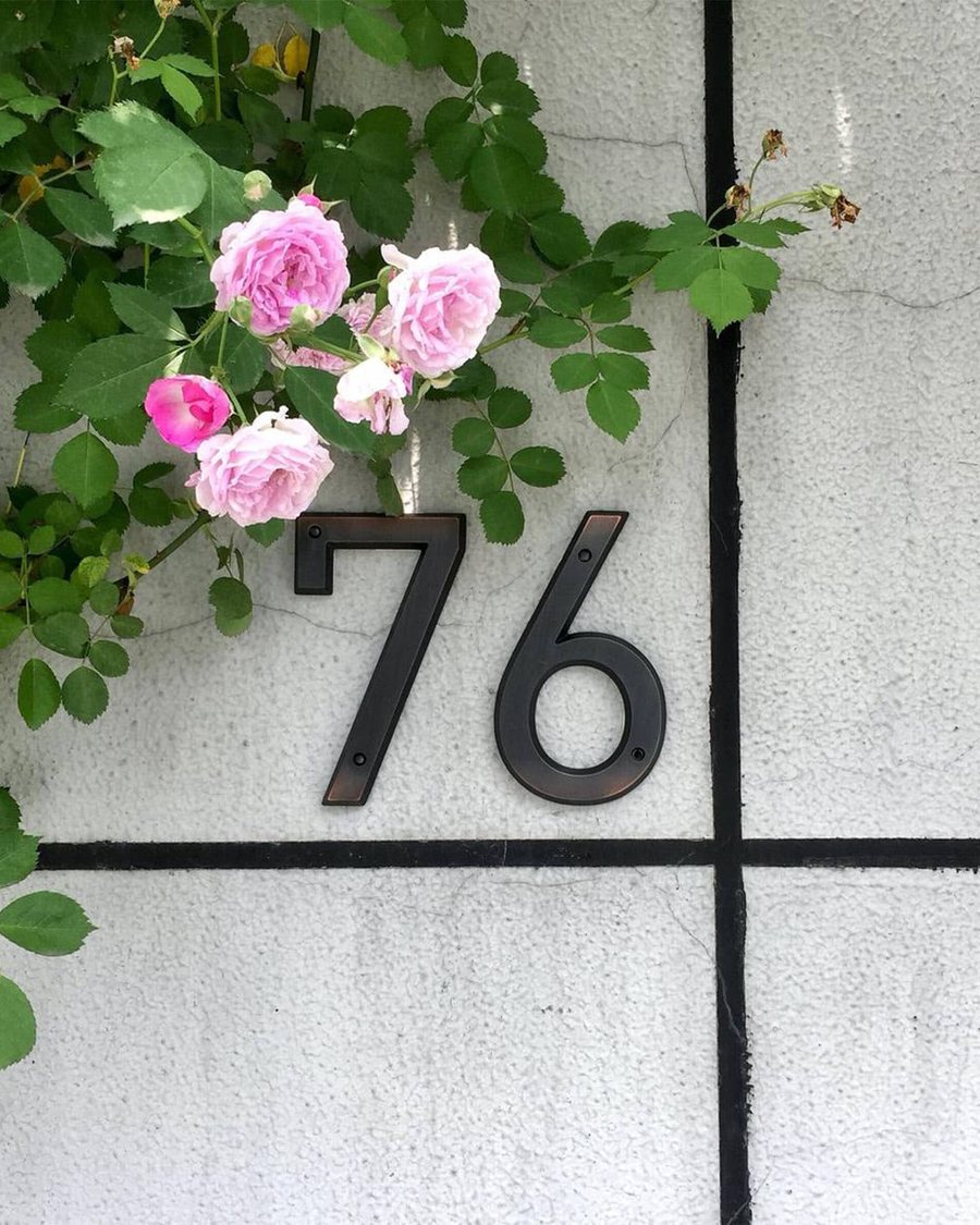
Matte black on a dark door can vanish at night, so in our view it belongs on a pale ground. Satin brass catches a porch light well.
6. Numbers lost in the panelling, or hidden when the door is open
Designers put the number where it sits naturally and stays in view: Holmquist’s test is that numbers « should sit naturally and not feel too crowded ». On a traditional panelled door, Country Life describes the classic arrangement, with the number at the highest point, usually central, and the knocker below it. Ideal Home adds that a four panel door usually has room for a central number, while a door with large glass panels may need it to one side.
Older doors can make that hard. Country Life notes that Victorian doors replaced the Georgian six panels with four, often with glass in the upper panels, which leaves little solid timber high up, and Homebuilding & Renovating suggests that older front doors often look better with the number on the surrounding brickwork or a nearby wall, where it won’t get lost in the panelling.
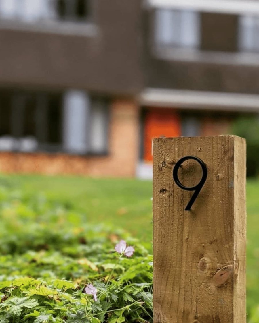
On most terraced and semi-detached houses we’d fix the number on the frame or the wall beside the door, at about eye height from the path, on the side people approach from; a number on the door disappears when it stands open. Where the door is far from the road, a number on the gate or gatepost does the job the door can’t, and on a stone post brass looks as though it has always been there.
Our house number ranges, and how they weather
The table sets out each range as its listing describes it.
| Range | Height | Material | Fixing | Finishes |
|---|---|---|---|---|
| METRO | 4 to 12 inch, about 102 to 305mm | Solid brass | Screw-fixed, concealed fixings, drill template | Satin brass, matte black, antique brass |
| EZRA | 4 to 12 inch, about 102 to 305mm | Solid brass | Concealed fixings, floating | Satin brass, antique brass, matte black, white, hammered satin brass, hammered antique brass |
| PECK | 10cm | Solid brass | Two screws included | Satin brass |
| AMYTHUS | 70mm | Solid brass, 3mm thick | Double-sided tape, or exterior adhesive on rough surfaces | Satin brass, matte black, antique brass |
| OBRE | 125mm | Zinc alloy | Screw-fixed with spacers and wall plugs | Satin brass, satin nickel, black |
| BROOKFIELD | 10cm or 15cm | Zinc alloy | Concealed standoff fixings, floating | Satin brass, matte black, brushed steel |
| ANTIK | 152mm | Zinc alloy | Concealed studs, held proud of the wall | Aged bronze |
Floating numbers need drilling and careful setting out, and our listings ask for a soft rubber mallet when fitting them. AMYTHUS numbers come with double-sided tape for smooth surfaces, and the listing recommends an exterior construction adhesive for brick, render or stone.
METRO, EZRA, PECK and AMYTHUS are solid brass. OBRE, BROOKFIELD and ANTIK are zinc alloy, as their listings say, and the brass, nickel or steel in some of their names describes the finish. Our guide to brass hardware explains why the material matters.
Outside, brass changes. The Copper Development Association’s design handbook explains that most copper alloys eventually weather to a grey-green patina, at rates and in colours that vary from alloy to alloy: yellow cartridge brass towards a yellowish grey-green, Muntz metal, a brass with more zinc, towards red-brown and grey-brown. Clear lacquer slows the change, though the handbook notes that nitrocellulose lacquers need redoing about once a year outdoors. Brass stays bright where hands touch it, and the CDA records brass push plates on a hospital entrance that had not darkened after 36 months, but a number nobody touches darkens evenly and slowly, over years. Powder-coated brass, such as EZRA in matte black or white, keeps its colour while the coating is sound. Zinc alloy relies on its finish: the International Zinc Association says bare zinc castings darken with age outdoors, corroding at about 3 microns a year in the country and up to about 10 in industrial and coastal air.
On a period house that change is often the point. The timber restoration specialist Alison de Roeck told Homes & Gardens to buy the best door furniture you can afford, check the maker’s advice on outdoor lacquers, and consider reclaimed pieces, which last well even if they need polishing.
If the house has a name as well as a number, we’d show both. METRO and EZRA include letters in the same sizes and finishes, AMYTHUS letters match the AMYTHUS numbers, and our custom signage service makes larger names in the same look. For the doors inside, our guide to choosing hardware door by door goes through the house, and all our numbers are in the house numbers collection.
Quick answers
How big should house numbers be?
Big enough to read from the street, which is the architect Mark Holmquist’s test. Designers give no minimum, so these figures are ours: at least 100 mm near the pavement, and 150 mm or more for a house set back from the road.
Where should house numbers go on a house?
Somewhere easy to read from the street: high and central on a panelled door, or on the frame or wall beside it, with numbers on the gate if the door is far back.
What house numbers suit a Georgian or Victorian house?
A modest serif numeral in black or aged brass. The Georgian Group notes that Georgian external fittings were usually black cast iron, rarely polished brass.
What are floating house numbers?
Numbers fixed on concealed standoffs, so they sit slightly off the wall and cast a shadow. They need drilling and careful setting out.
Do brass house numbers tarnish outside?
Yes, unless they are coated. Copper alloys slowly weather towards a patina outdoors; lacquered or powder-coated brass keeps its colour while the coating lasts.
Do I need permission for house numbers on a listed building?
Possibly. Ask the council’s conservation officer before fixing anything, as the Georgian Group advises before any work to a Georgian house.
Sources
- Livingetc: This is the teeny-tiny (and often forgotten) front door detail that says the most about your sense of style. Mark Holmquist on period lettering, contrast, placement and lighting.
- Livingetc: Front door ideas. Tom Rutt on bronze, aged brass, chrome and black hardware; Abigail Ahern on a light over the door.
- Country Life: What does your front door say about you? Christopher Boyle; where the number sits; Victorian and Edwardian door furniture.
- House & Garden: How to choose the right front door for your house. Rita Konig on near-black doors; matching hardware to the door.
- Architectural Digest: Front door colors. Emilie Munroe and Chauncey Boothby on brass against a painted door.
- Homebuilding & Renovating: Front door furniture ideas. Numbers on the brickwork of older doors; etched numbers on modern ones.
- Ideal Home: House number ideas. Larger numbers when set back; centred on panelled doors, to the side of glazed ones.
- Homes & Gardens: Cottage front door ideas. Alison de Roeck on door furniture, lacquers and reclaimed pieces.
- The Georgian Group: Guide No. 3, Doors. Black cast iron fittings, discreet additions, consulting the conservation officer.
- Design Museum: Jock Kinneir and Margaret Calvert. Lettering size, stroke and reading distance on British road signs.
- Copper Development Association: Copper in Architecture Design Handbook (A4050-8/24). How brass weathers outdoors; lacquer life.
- Copper Development Association, Antimicrobial Copper: FAQ. Handled brass push plates that had not darkened in 36 months.
- International Zinc Association: Finishing, general comments. How bare zinc castings weather outdoors.
Images: Product photographs and diagrams are our own.