




In short
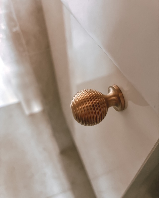
Pair warm with warm, and use contrast on purpose. Cream, putty, deep green and most woods sit best with warm metals such as satin or antique brass. Pale blue and bright white also suit satin nickel or chrome. We find matte black suits almost anything. Then choose the sheen, and check the tap and worktop before ordering.
Handles take up very little of a kitchen, but they are the part you touch every day, and they are often the last thing to be chosen. By then the cabinet colour is usually settled, so the question becomes which metal will look right against it.
There isn’t one correct answer. There are a few reliable starting points, though, and most of them come down to three things: warmth, contrast and sheen.
Start with the undertone
Every cabinet colour leans either warm or cool, and paint makers apply that to neutrals as well. Dulux describes warm whites as carrying hints of pink, orange or yellow, and cool whites as carrying hints of blue, green or violet, and the same goes for stronger colours. That makes cream, putty, terracotta and most woods warm, and most blues and bright whites cool. Greys can go either way, which is why Dulux sorts its own greys into warm, cool and true greys.
Metals have a temperature too. Brass is a yellow metal, so it reads warm. Chrome is cool, and the Royal Society of Chemistry describes chromium as a silvery metal with a blue tinge. Nickel is cool beside brass but softer and a little warmer than chrome. We treat black as neutral.
A warm metal on a warm colour looks settled and calm. A warm metal on a cool colour gives contrast, which looks fresh and deliberate. The pairing we find most often looks uncomfortable is a bright, cool metal on a very warm colour, such as polished chrome on a creamy painted kitchen, where the blue in the chrome starts to show.
If you aren’t sure which way your colour leans, compare it with something pure white rather than judging it on its own, which is the test Sherwin-Williams suggests for reading undertones. Hold a painted door or a paint card next to a sheet of plain white printer paper in daylight. A warm colour looks a little yellow or pink beside the paper. A cool colour looks grey, green or blue.
A quick guide by cabinet colour
Use the table as a starting point. The pairings are our own, and the sections after it explain each one, including where designers disagree.
| Cabinet colour | Finishes that work best | The effect |
|---|---|---|
| White and off-white | Satin brass, polished chrome, satin nickel, matte black | Brass warms it, chrome and nickel keep it crisp, black adds a graphic line |
| Cream, putty and stone | Satin brass, antique brass, polished unlacquered brass | Soft and tonal, with nothing harsh |
| Sage and soft green | Satin brass, antique brass | Gentle warmth that suits the grey in the green |
| Olive and deep green | Satin brass, polished brass | Rich contrast, with the brass reading almost gold |
| Pale blue | Satin nickel, satin brass | Nickel stays cool and quiet, brass adds warmth |
| Navy and deep blue | Satin brass, polished unlacquered brass, satin nickel | Brass for warm contrast, nickel for a cooler look |
| Black and charcoal | Satin brass, antique brass, satin nickel | Brass glows against dark paint, nickel is more restrained |
| Light grey | Satin brass, matte black, satin nickel | Brass to warm it, black for definition, nickel for a tonal look |
| Light oak | Matte black, satin brass | Black for a clean line, brass for warmth |
| Walnut and dark wood | Satin brass, antique brass | Brass lifts the grain without competing with it |
White and off-white kitchens
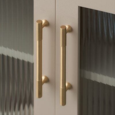
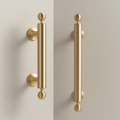
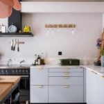
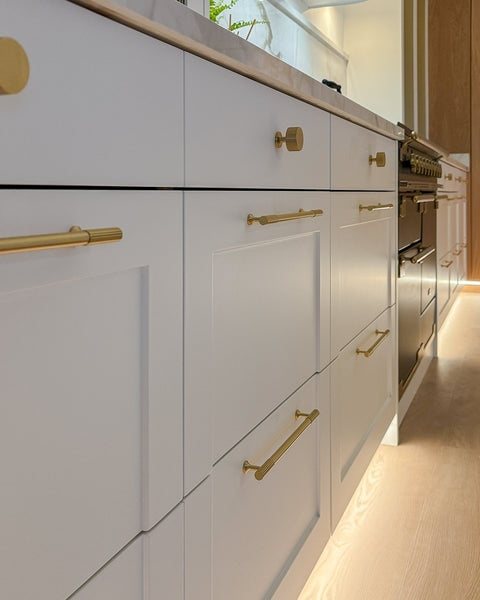
White is the one colour where almost every finish works. Homes & Gardens notes that it pairs with warm and cool tones alike, so the choice is really about the mood you want. Satin brass, on a handle such as COMMET, makes a white kitchen feel warmer and a little more traditional, particularly on a shaker door. Polished chrome or satin nickel keeps it bright and crisp, which suits a flat slab door and a room with plenty of daylight. Matte black draws a clear line on every door and drawer. In our experience that looks sharp when the handles are evenly spaced and the same size, and busy when they aren’t.
Look closely at your white before deciding. To our eye a pure, bright white suits a cool metal best, and an off-white with some cream in it is usually happier with brass.
Cream, putty and stone
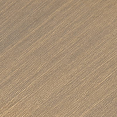
Soft, warm neutrals are where brass looks most natural. Satin brass gives an even, gentle glow. Antique brass is darker and quieter, and suits a kitchen that is meant to feel lived in from the start.
Polished unlacquered brass is another good choice here. It arrives bright, and because it has no lacquer it darkens slowly with time. The Copper Development Association explains that bare copper alloys oxidise and darken naturally, and that indoors a noticeable change can take years. It also records brass push plates on a hospital ward entrance in Birmingham that had not darkened after three years, and in our experience the parts you hold most keep a little more shine than the rest. Our guide to polished unlacquered brass explains how to look after it.
Green, from sage to forest
Many of the greens used in kitchens are softened with grey. Farrow & Ball describes its French Gray as a soft sage grey with green, stone and silvery undertones. In our view that muted quality is why brass suits these greens so well.
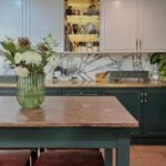
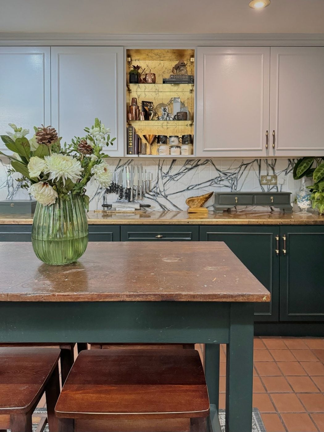
With sage and other soft, greyed greens, satin or antique brass keeps the look gentle, and we find a highly polished finish can look a little loud against such a quiet colour. With deep greens, from olive to forest, brass becomes the natural contrast, and Homes & Gardens recommends it as the classic finish for olive cabinets. To our eye it reads almost gold against dark paint, and both satin and polished brass work.
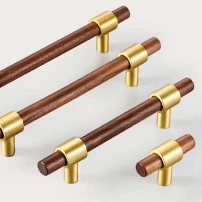
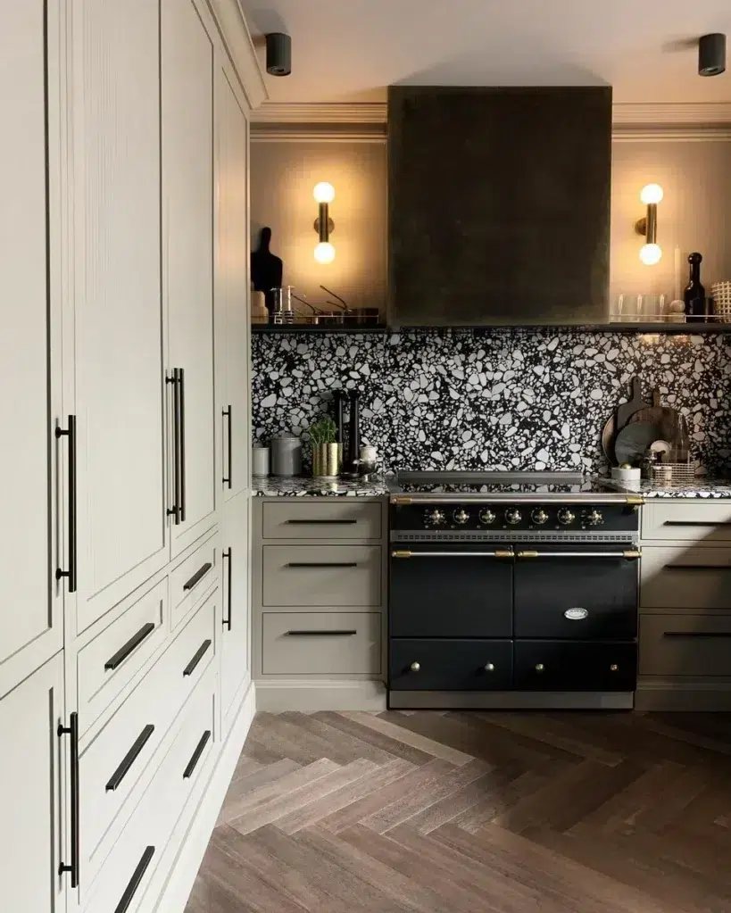
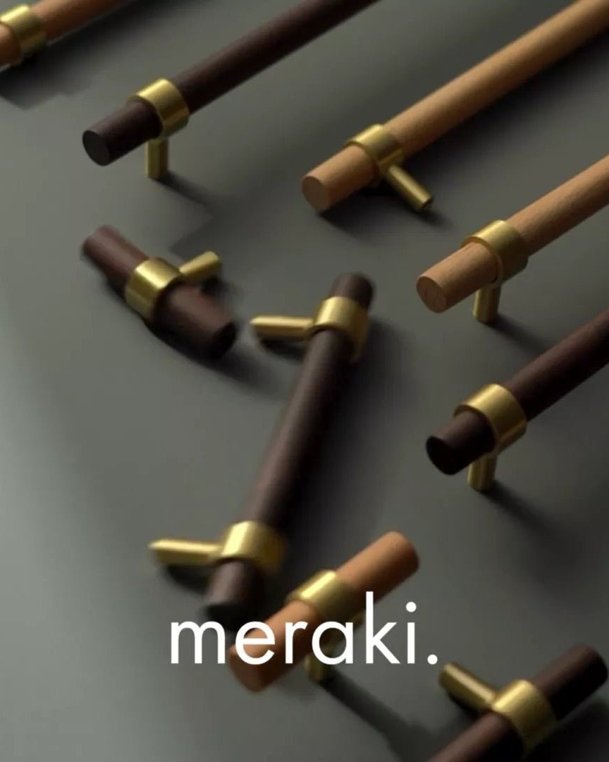
Walnut and brass handles such as CIRCA add a third material, which helps a green kitchen that already has wooden worktops or open shelves.
Blue, from pale to navy
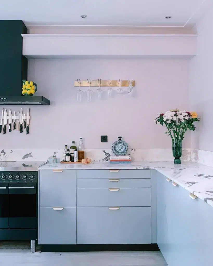
Pale blues are usually cool, and Farrow & Ball notes that north light brings out their cooler notes. Satin nickel sits quietly against them and keeps the room light, which is also the pairing Livingetc suggests for a light blue kitchen. Satin brass works as well and brings some warmth, which we think helps in a kitchen that faces north.
Navy has long been paired with brass, and Homes & Gardens describes navy cabinets with warm brass pulls as a truly classic scheme. A deep, cool blue against a warm metal gives strong contrast without looking harsh. Designers don’t all agree, though. Some quoted by Livingetc now see navy with brass as a look that was everywhere from about 2015 to 2022, and prefer nickel or chrome for a sharper, cleaner finish. We still like brass on navy, and satin nickel is the choice if you want the cooler version.
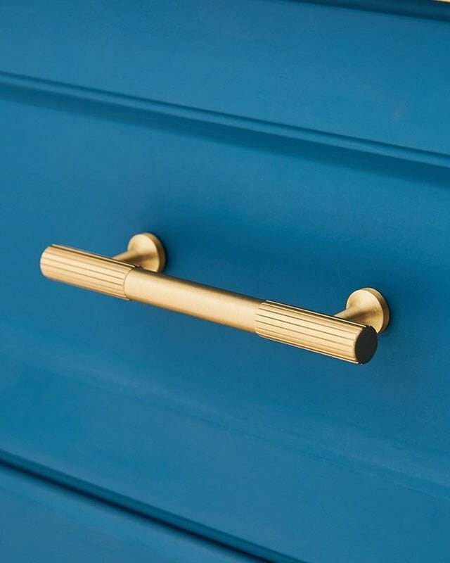
Choose polished unlacquered brass if you would like the handles to soften over time, or satin brass if you want them to stay much as they arrive. Our satin brass is lacquered, and the Copper Development Association explains that a clear coating slows the tarnish that bare brass forms.
Black, charcoal and dark grey
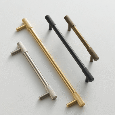
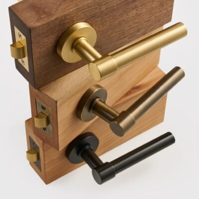
We think dark kitchens give brass the most room to stand out, because the metal picks up what light there is against the dark paint. Homes & Gardens quotes designers who say aged brass or brushed metal will always work well against darker cabinetry. Satin brass is our usual choice. Antique brass is lower in contrast and suits a moodier scheme. If you want something quieter still, satin nickel reads as a soft grey highlight rather than a flash of gold. MANHATTAN comes in satin brass, antique brass, satin nickel and matte black, so one design can follow any of these choices.
Matte black handles on black doors are a choice in their own right. The handles almost disappear, which can look very calm, but in our experience they are harder to find in a dim room, so the idea works best in a kitchen with good lighting.
Light grey
Light greys can lean warm or cool, though in our experience most of the light greys used in kitchens read cool. Homes & Gardens points out that grey’s lack of warm tones can make a room look flat, and warns that steel-coloured finishes can sit too close to grey and leave the room looking one-dimensional. Satin nickel is close to steel in tone, so it gives a calm, tonal result but little contrast. Matte black adds definition. Satin brass is the way to warm a grey kitchen up, and in our view it is often the simplest fix for one that feels cold.
Oak, walnut and other woods
Most wood is warm, though limed and very pale timbers can read cooler, a distinction Farrow & Ball also draws when matching paint to timber. Either way, the choice is mostly about contrast.
On light oak, matte black handles give a clean, Scandinavian line, while satin brass adds warmth with very little contrast. On walnut and other dark woods, brass stands out more and lifts the grain. Antique brass is the softest option on any wood, because to our eye its colour sits close to the wood itself. KANA comes in five finishes, from satin brass and antique brass to satin nickel and matte black, which makes it easy to try the same handle against the wood and the paint.
If your kitchen mixes painted doors with wood, we’d choose the handle for the painted doors first, since there are usually more of them, and then check it against the wood.
The tap, the worktop and the light
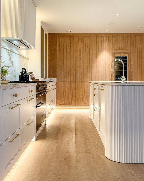
Handles are never seen on their own. The tap, the worktop and the lighting all sit in the same view, and any of them can tip the decision.
The tap doesn’t have to match the handles, but the two should look as though they were chosen together. One designer told Livingetc that the tone matters more than an exact match: cool with cool, warm with warm. In our view brass handles beside a chrome tap can look like an oversight, while brass with a black or nickel tap looks intentional, especially when that second metal appears somewhere else in the room. Designers quoted by Livingetc suggest repeating each finish at least twice so that a mix reads as deliberate. Our piece on mixing metals at home goes into this in more detail.
Worktops matter too, and the same undertone test applies. To our eye white quartz with grey veining leans cool, while marble with warm veining, terrazzo with ochre flecks and wooden worktops lean warm, which can tip the balance towards brass.
Then look at the light. Farrow & Ball notes that halogen and incandescent bulbs give a yellow light that makes colours look warmer, while cool white bulbs give a bluer one. In our experience a warm, yellowish light makes brass look richer and can give nickel a faint yellow cast. Farrow & Ball also points out that northern light brings out the cooler tones in a colour, and brass looks paler under it than it does in a sunny room.
Satin, polished or aged
Once you have chosen the colour of the metal, choose the sheen. It changes how the handles look and how much they show the marks of daily use.
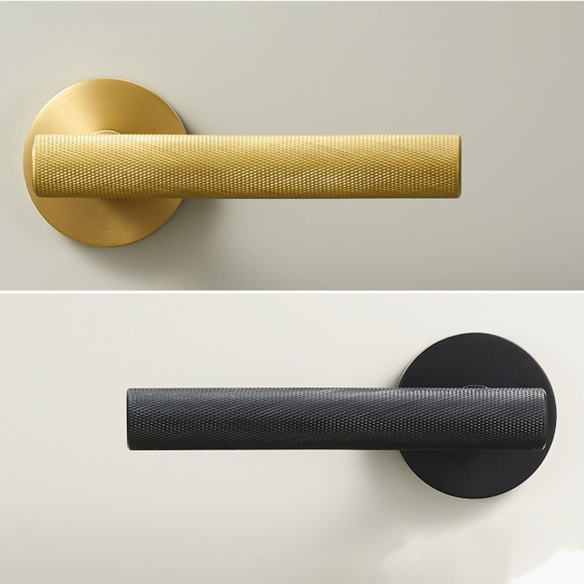
Satin finishes are brushed, which leaves a soft sheen of very fine parallel lines. The British Stainless Steel Association notes that brushed surfaces do not fingerprint easily, which is why they are used on doors and other things people touch all day. Polished finishes reflect more light and look brighter, and the Copper Development Association points out that their high reflectivity tends to show even slight flaws. In our experience they show fingerprints more readily too, which matters on the drawers you open most. Aged finishes such as antique brass are darker and lower in contrast, and suit kitchens that are meant to feel established rather than new.
For a busy family kitchen, we think satin is the practical choice. In a quieter kitchen, a polished finish can bring more light into the room. Our finish and care guide describes every finish we offer and how to clean each one.
See it before you decide
Screens are poor at showing metal. Dulux warns that colours on screen vary with your screen settings, and in our experience the same brass can look yellow, pink or brown from one photograph to the next. Finish names are loose as well. The Copper Development Association points out that even the word bronze is commonly used for copper alloys with little or no tin, so one company’s antique brass can easily be another’s bronze.
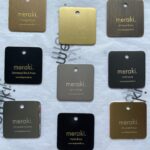
The most reliable way to choose is to hold a real piece against your cabinet door, in daylight and again in the evening, next to the tap. Paint makers give the same advice for colour: Farrow & Ball suggests moving a sample around the room to see how the colour changes through the day. You can order finish samples of our handles and knobs to do exactly that before you commit to a whole kitchen.
Quick answers
Do kitchen handles have to match the tap?
No, but they should look as though they were chosen together. Matching is the simplest route. If you mix, keep to two metals and repeat the second one somewhere else in the room.
What colour handles suit a green kitchen?
Brass, in most cases. Satin or antique brass suits sage and soft greens. Satin or polished brass suits deep greens such as olive and forest.
What colour handles suit a navy kitchen?
Satin brass or polished unlacquered brass for a warm contrast, or satin nickel for a cooler, quieter look.
Should I choose brass or black handles for a white kitchen?
Brass makes a white kitchen warmer and softer. Black gives a sharper, more graphic look and suits flat slab doors and a modern scheme.
Which handle finish shows fingerprints the least?
Satin and brushed finishes, such as satin brass and satin nickel. The British Stainless Steel Association notes that brushed surfaces do not fingerprint easily, and in our experience polished finishes show marks more readily.
Will brass handles date?
Brass has been used on furniture and door hardware for centuries. The V&A holds a cabinet from about 1700 with brass drop handles and a Birmingham door lock in a pierced brass case from the same period. Homes & Gardens’ designers suggest warm metals with an aged or brushed finish for kitchen details that outlast trends, so satin and aged brass are the safest choices.
Can I use knobs and handles in different finishes?
You can, but we think it usually looks calmer to keep one finish and vary the shape instead, with knobs on cupboard doors and handles on drawers. Our guide to choosing handles explains the sizes.
Sources
- Copper Development Association: Copper in Architecture Design Handbook. Tarnish and clear coatings, satin and polished finishes, and how loosely the word bronze is used.
- Copper Development Association: Antimicrobial Copper FAQ. Brass as a yellow metal, how slowly bare brass darkens indoors, and handled surfaces staying bright.
- Royal Society of Chemistry: Chromium. Chromium’s blue tinge.
- British Stainless Steel Association: Specifying polished, brushed and buffed finishes. Brushed surfaces resist fingerprints.
- V&A: Cabinet by John Byfield, about 1700. Brass drop handles on furniture.
- V&A: Lock by John Wilkes, Birmingham, 1680 to 1700. Brass door hardware.
- Farrow & Ball: How Light Affects Colour. North light, warm bulbs and looking at colour through the day.
- Farrow & Ball: Neutral Groups. Warm and cool neutrals against warm and limed timbers.
- Farrow & Ball: Blue Colour Schemes. North light and the cooler notes of blue.
- Farrow & Ball: Green Colour Schemes. Sage greys and their undertones.
- Dulux: How to get the right white for your room. Warm and cool undertones in whites.
- Dulux: How to find the right shade of grey. Warm, cool and true greys.
- Farrow & Ball: Samples. Looking at a sample through the day.
- Dulux: Colour accuracy. Colours vary on screen.
- Sherwin-Williams: Understanding Paint Undertones. Reading an undertone against pure white.
- Homes & Gardens: What color hardware goes with a white kitchen?. White with warm and cool metals.
- Homes & Gardens: Olive green kitchen cabinet ideas. Brass as the classic finish for olive.
- Homes & Gardens: Are dark blue kitchens still on trend?. Navy and brass as a classic scheme.
- Homes & Gardens: Black kitchen ideas. Aged and brushed brass against dark cabinetry.
- Homes & Gardens: Gray kitchen mistakes. Grey looking flat, and steel finishes against grey.
- Homes & Gardens: What’s the most timeless kitchen hardware?. Aged and brushed warm metals.
- Homes & Gardens: Kitchen hardware trends. Nickel as softer and warmer than chrome.
- Livingetc: Modern navy blue kitchens. Satin nickel in a light blue kitchen.
- Livingetc: Navy and brass. The case that the pairing now looks dated.
- Livingetc: Should your kitchen tap match?. Matching tone rather than finish.
- Livingetc: Mixed metal kitchens. Repeating each finish at least twice.
Images: Product photographs and diagrams are our own. Top image: Bland Design. Project photographs are reproduced with credit to the designers, homeowners and photographers named, who own them. Openly licensed images are used under the licence stated. Third-party photographs show real rooms and may include fittings and finishes that are not ours.